Posts

Showing posts from March, 2018

the process posts

So today is Easter Sunday and my weekend and final spring break has come to an end. Again as my mom drives back with me in the car, I reflect on my weekend, and I actually, to my surprise, found inspiration in things I never expected to. In Winter Park, which is a really nice area on Orlando, I found inspiration. The little town is quaint and has little shots with cobble stone roads, it felt so cozy and peaceful, yet still beautiful and high end. This may sound super weird but that’s how I want my magazine to feel. I want it to feel casual yet sophisticated. So I want to use ideas and themes from the little town , and incorporate it in the design of my two page layout. I’m not quite sure how I’m going to do s, but I just felt so inspired see all the little store signs with different fonts and colors, it was so fascinating to try and understand there choices and review them in my mind.  If given the opportunity to do another magazine of some sort, I would defiantly try to centralize

the process posts

Ok so since my last post was centralized around my table of contents and my new plan for the pictures, this post is going to be about the two page layout. As previously addressed Canva doesn’t allow me to put my two pages side by side. So I’ve come up with a way to make it uniformed and cohesive. So for my two page layout I plan to have the title be in two different fonts, one with a sort of typewriter font feel and the other in script, I wanna do this so that one word stands out, such as “Galentines day” in script. This draws the readers focus to the main idea of the article, while still having it look nice and a little unconventional. I want all my pictures to be in the right bottom hand corner of the page in a sort of collage wait where they form a square consisting of 3 or 4 pictures, and the on the next page it continues. So on the second page, the pictures would then continue on the top right hand corner of the page followed by the text on the left hand side and continuing be

the process posts

So I am currently on the way to Orlando, specifically the UCF campus to visit my sister. It’s about a 3 hour drive from where I am so I have a long car ride ahead of me. Since my mom is driving, I’m able to further discuss my plans for my table of contents and two page layout. For my table of contents, I thought I would use pictures from this weekend but I think now, that I’ve really thought about it deeply I should make the pictures related to something other than just the main topic. Instead of using pictures of the girls, similarly to the front cover, I want to use photos of makeup and other things pertaining to women’s lifestyle such as advice or workout regimes, I’m not quite sure yet. I also want to make the pictures more vivid in oposition to the front cover image. The front cover image is more trasnparent and almost has a film on it with a pinkish red hue in the background, by increasing transparency it allowed the background to peak through and change the vividness of the

the process posts

Next weekend I am going back up to Orlando to see my sister, which I am excited for obvious reasons, but also so I can conclude my pictures. I feline continuing my pictures with the same girls, and in the same area, it will give a more uniformed and planned look to the magazine. Obviously the photos will be individual and different from the rest, but they will have a similar vibe to them. I plan to use the photos I take for my table of contents, and two page spread. My table of contents has about 7 hexagons on it, which is where the pictures will be placed. Each picture will pertain the pages story or interest point. For my two page spread, I don't want to bombard the page with photographs, so I'm thinking only 3-5 five pictures, in different sizes and locations so it doesn't look too clustered. Also since my two pages are going to have to be separated I want to ensure that I take the least confusing paths for my viewers, following the minor bump in the process.

the process posts

So I received some pretty upsetting news today. Apparently there is no way I can create a two page spread through canvas, I would have to make it so show only one page, followed by the other page. This got me a little angry because jog was giving me problems to even use it, and now canvas is altering my vision for my two page layout. Understanding that these little bumps in the road to happen, and ill have to get over it, its just annoying because i have everything else done, and to transfer all that to jog, and most likely mess up what I already have done, isn't something I really planed for, or want to do. With that being said, it looks like its back to the drawing board for me. I ma going to have to redesign my initial plan for the two page spread, in order to make it work for the two separate pages, and make it look like it wasn't unplanned and disorganized. Having it look that way is my main concern because I feel like if the two pages don't look like they go toget

the process posts

I've fallen a little behind on my blog postings for week 4, I think it's due to the fact that I haven't had much to work on since I've gotten so much of my magazine requirements done, that I've sort of been procrastinating doing the remainder of my project. Also this coming week is spring break, and it is my last high school spring break, so that contributes to a lot of my procrastinating habits as well. Considering I have a grand total of 5 more blog posting by Sunday night, It's time to get myself back into focus and start working again. I have to add photographs toy table of contents  and do my two page layout , and then my magazine is mostly done, after that all I have left to do are some final touches to the pages and add small details to truly perfect and portray my vision for this magazine.

the process posts: choices

Image
Today I started my table of contents page, which is much more difficult to create than I could've ever imagined. Considering I have to make pages/stories beyond what I am presenting in my magazine it makes it all the most difficult. I also have to take photos for the little preview images of the story and its theme. I chose to make my table of contents title font the same as the masthead on the cover page, I did this because I wanted it to be uniformed, but in order for it not to be exactly like the cover page, I made the font a soft pink hue, I chose pink to tie into the theme of love as well as the cover images' hue. I picked a back drop that is white with black polka dotted diamonds all connected, I feel as if this backdrop is elegant but not too girly. I picked my image cut outs to be hexagonal because I though it added dimension to the page, it also looked like honey combs, and honey combs are sweet. Sweetness is another major theme in February, so I feel like it ties

the process posts: feedback

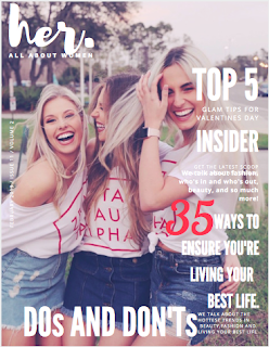
 Today my teacher held a class feedback session, We were spilt into groups of 4 or 5 and we each went over our work, showed our blogs, and discussed our future plans. Out of my group members I had the most work done, so I was able tog et the most feedback. Luckily I did not receive any truly negative feedback. Most of my classmates enjoyed my layout, font, photograph, and over all magazine choices. We discussed my changing the "35" on the cover to a plethora different hues of pinks, and reds, but we finally settled on just leaving it white. Leaving it white looked the most uniformed and prevented the number from getting lost in the image, (we all agreed) though it doesn't necessarily stand out or jump off the page, it is visible and doesn't clash with the pink hue of the cover image. I found that the feedback session gave me a lot of different opinions, and ideas for the rest of my magazine,including the two page layout, which is what my next blog post will be f

the process posts

Hey, I don't really have anything to update you guys with but I'd like to talk about my progress and the process thus far. Truthfully I've found the overall process ti be very enjoyable and pleasant, I've had no major issues or bumps in the road, so thats very comforting. I anticipated this to be much more challenging, with all the decision making involved, but I'm so pleased with how my magazine has turned out so far.  The cover page took me quite a while to perfect and be truly content with it. I changed so many aspects of it so many times. From cover images to fonts, I tried nearly every possible combination, sometimes I would leave the combination for a couple of days just to see if i would get tired of the design or layout, or I would change 3 times in a day, it all just depended on how the combination made me feel.  Certain aspects of this process I really hate, i hate making permanent decisions, but with the help of this assignment, and process it

the process posts: choices

Image
Making choices like these are so difficult, especially for me because I'm probably the most indecisive person in  the world. I have trouble committing to literally anything, especially important things like this magazine. With that being said anything I currently have on my magazine cover is subject to change as anytime during this process. It may change once, twice, not at all or 50 times, but eventually it will be just right. Currently chose my layout, and I elaborated on my layout choices on my "the process posts: layout" post. In that post I didn't really address my choices in terms of font and positioning. I chose my  masthead front to be in a style called "brush" which is a cursive font that look like it was written with a paint brush. Truthfully I chose this font because I watch all these penmanship/handwriting videos on  Instagram and I find them to be so feminine and beautiful, and this font reminded me of that, which is perfect for a women's

the process posts: photography

The photography portion of the magazine making was actually the most challenging for me. Every detail had to be right and coincide with one another in order to get a nice looking photo. In my post prior to this one I showed you guys all of the pictures I took that day, some I do not intend to use but they were part of the cluster of photos I took. Some where too dark, some had too much wind, and in some the girls didn't look as naturally happy as I was going for. Taking the photo was difficult because my "models" wanted to mess around and were not taking things as seriously as I needed them too. In the end it all worked out and I ended up getting some pretty awesome pictures for my magazine, so I'm happy with the experience. After taking all the pictures, I selected the one I wanted to use for the cover and started playing around with the edits and filters. On the actual photograph i used the app called vsco ( http://vsco.co ) for the iPhone which provides a larg

the process posts: layout

Image
Here are some pictures i took and debated on for the cover of my magazine

the process posts: layout

Image
This weekend I went to visit my sister in UCF and asked her and her sorority sisters to take pictures of them for my magazine, since they were doing a valentine's day event, I though it would be a perfect opportunity for me to get good pictures I have an I phone 8 plus so I used that as my camera, using portrait mode or the HD option to capture the photos. I opted to get the girls doing a more "candid" type of image because  feel as if it portrays more emotion and feeling. For the month of February I had more of a Galentine's day theme to show women loving women to assimilate with my genre of Women's lifestyle  I put a red hue to the background go the image and made it a little bit more transparent so the red could peak through. I did this because it is a February issue and February is usually associated with Valentine's Day and love and romance.  I chose to place my magazine name in the left corner because I thought it looked better but also becaus

the process posts

I took the weekend to weigh out the pros and cons of each magazine genre. With that being said I have decided to go with a Women's Lifestyle magazine. I picked this because with my research behind me I feel as if this genre is a broad enough topic, which allows me to really individualize my work and cover enough element stop keep it interesting. Also because I am an 18 year old girl, i feel like I can really dive into this genre and make a magazine other women would want to purchase and read. My teacher gave me access to Joomag, which is  magazine making program, I plan to try it out tomorrow and see how i like it. My other option is Canva which is similar to Joomag, but I found Canva to be a little difficult to work and navigate. In the event that I find Joomag just as difficult, I will probably gravitate towards Canva considering I already have experience with it. I plan on posting sample layouts for my cover page tomorrow along with color pallets and font choices. Currently

the process posts

Image
These are some sample magazines with a pink/red color theme to give a flirty vibe.