the process posts: choices
Making choices like these are so difficult, especially for me because I'm probably the most indecisive person in the world. I have trouble committing to literally anything, especially important things like this magazine. With that being said anything I currently have on my magazine cover is subject to change as anytime during this process. It may change once, twice, not at all or 50 times, but eventually it will be just right.
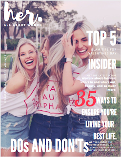
Currently chose my layout, and I elaborated on my layout choices on my "the process posts: layout" post. In that post I didn't really address my choices in terms of font and positioning. I chose my masthead front to be in a style called "brush" which is a cursive font that look like it was written with a paint brush. Truthfully I chose this font because I watch all these penmanship/handwriting videos on Instagram and I find them to be so feminine and beautiful, and this font reminded me of that, which is perfect for a women's magazine.
The masthead itself is infall lowercase letters with a period at the end because I felt as if the period really emphasizes the word and makes readers understand it. For the all lowercase lettering, there really isn't any elaborate decision making scheme behind it, I simply though it looked cleaner and prettier that way. The majority of the other cover lines are written in a clean crisp font in all caps to provide a nice contrast to the title, as well as set the title aside from everything else.
I currently have all the writing on the cover page in white because I feel as if by keeping them all the same color I'm not drawing the focus away from the cover image in anyway, but at the same time I'm still shifting their focus to the coverless and they're intriguing to read. I positioned them on the right hand side, out of the way from the image so that the cove is easy to digest, and readers can appreciate one factor at a time without having to sit there and dissect the magazine right away.
Currently I am in the process of trying to figure out how to upload a barcode without totally messing up my entire layout, unfortunately I never got to try jog because it was giving me too many technical difficulties, so I am using convened trying to iron out the kinks one step at a time.
until next time!
also here is a my current cover page ↓

Comments
Post a Comment